Cigarattes Magazine
A conceptual editorial project inspired by the visual language of cigarette packaging. Mixing bold typography, minimal layouts and retro aesthetics, this magazine explores the contrast between design clarity and expressive storytelling.
Work report
This project focused on the corporate design of our university, HSBI. We analyzed the existing visual identity, broke it down into its core elements, and rethought it from a new perspective to explore fresh possibilities and alternative design directions.
Work report
In this project, we were assigned to an agency and asked to select one of its existing projects. The goal was to deconstruct the existing corporate design and reassemble it in new ways, exploring alternative visual systems, variations, and potential extensions of the brand.
Journal
A mix of playful illustrations, bold layouts and colorful visual experiments. Combining minimal structure with expressive character, this project reflects the core of my creative identity.
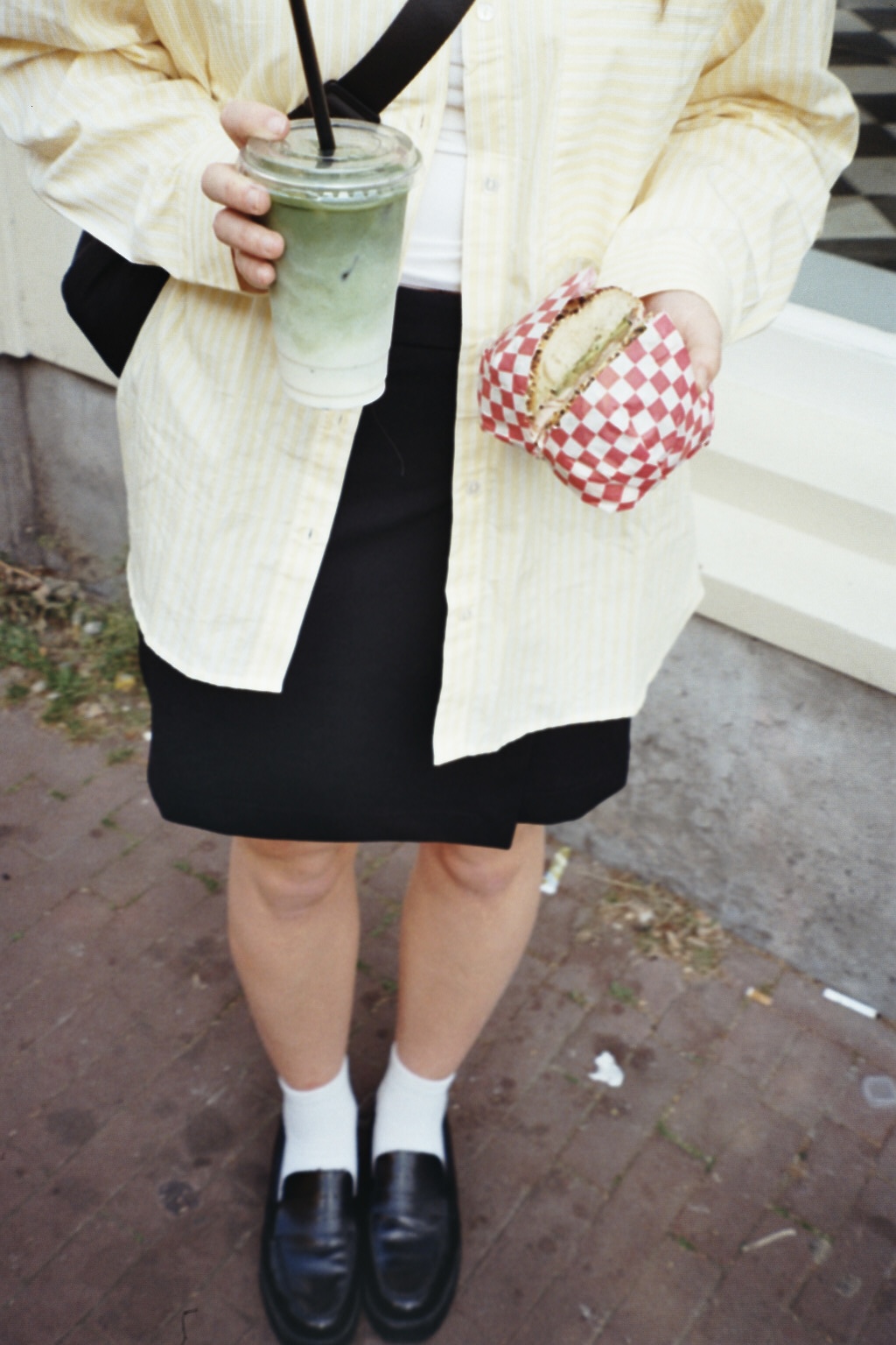
Photography
A curated collection of analogue photography, capturing quiet moments, colors, structures and everyday details. A visual diary blending minimalistic composition with emotional depth.
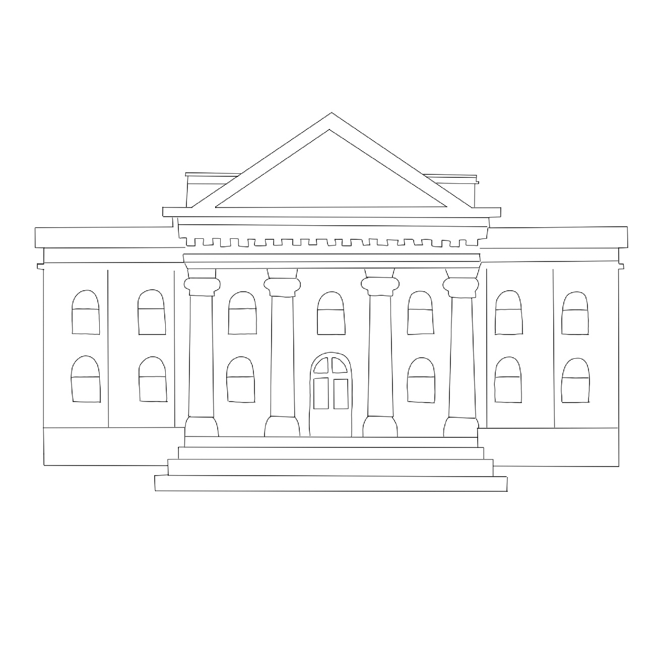
Website
An interactive museum website concept with a focus on visual identity, layout, and user experience. I developed the structure and design language and translated it into a coherent web interface.